Challenges, challenges, challenges. Solutions and more solutions! The office color and stencil selection was challenging, but read on to see how many challenges were solved by taking the time to choose wisely!
What do you get when you wallpaper over plaster walls? That would be permanent wallpaper, at least in my office.
Who ever put up this wall paper had no intentions of it every being removed. It is stuck to the plaster walls like peanut butter on bread. It is NOT coming off without taking the plaster with it. It is not peeling anywhere, not even a tiny bit.
The old house issue in this room:
The wallpapered plastered walls have been painted a dirty white color and the wallpaper seams show through making it obvious that it is painted over wallpaper. Solutions??? (I really spent a lot of time thinking through this one)
Rip out the plaster and replace with sheet rockThe old plaster walls are just in too good shape to be this drastic!Paint a nice color and get over itThis would be the practical thing to do. Fast, simple and BORING!Re-wall paper the wallsEnough is enough already! Not happening, too expensive and I will get tired of it!- Paint and stencil to give the look of wallpaper. Yep, this would be the one. Hard, time consuming and tedious but absolutely stunning!
Being a stencileer from way back when country ducks in blue and pink where popular, I set out to find just the right stencil for our office. The goal was to make the painted wallpaper look like wall paper seams and all! But first, we need to talk a little about color selection, because if you don’t get that right, it just isn’t gonna look right.
In addition to the painted wall paper issue, this room is shady. I say shady instead of dark, because there are two windows in the room letting in natural light and views of the trees and mountains . However, this room is the corner room on the front of the house and both sides are covered by the large wrap around front porch. In addition to additional lighting (Vintage Owl Lamp), choosing the right color and paint technique will make a huge difference in bringing life into this room. Let’s take a look back at this office…
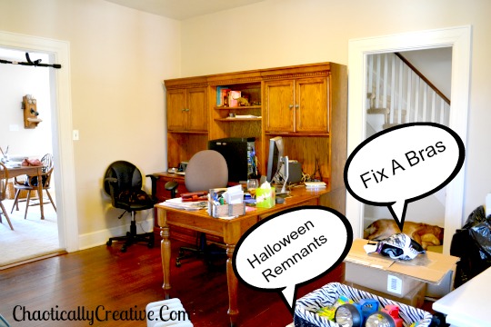 This picture was taken awhile back before the project begin. There is just no life or anything interesting in this room. The color of the walls, the furniture and the floor do not accentuate each other making the room feel drab and boring.
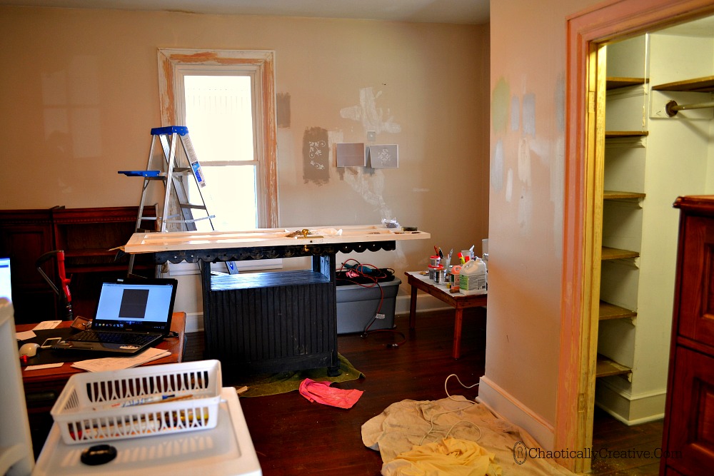 At this point the project has begun, sometime back in Feb. 2014 (we are now in August) . I was stripping multiple layers of paint, repairing cracks in wooden door panels and fixing the patched plaster ceiling. While this was going on, I was also going through the process of selecting colors and a stencil color as you can see from all the samples on the walls. I looked at this color combos at all times during the day. Finally, it all came together with this color combo…
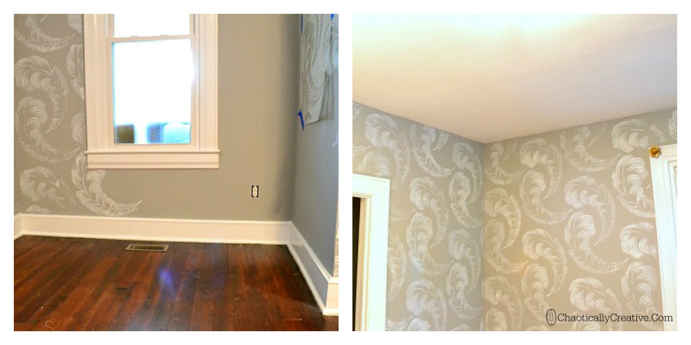
Notice how the colors and patterns compliment each other and add movement, light and interest to the room? They play off each other and the room seems brighter without adding any additional lighting. Here is what I decided on and why:
Benjamin Moore Coventry Gray flat for the walls. This shade of gray was light enough not to make the room darker but dark enough for the white in the stencil, trim and ceiling to pop. It also looked good with the color of the old wood floors.
Clark and Kensington Hi Gloss Enamel Designer White for the trim. I actually started out with a satin sheen for the trim because the wood work was so beat up. However, I began to notice that when it was wet and shiny, light reflected off it and added some light to the room. Crazy right! So, I opted to enhance the imperfections by using the Hi Gloss trim and it paid off. Shine is important in a shady room.
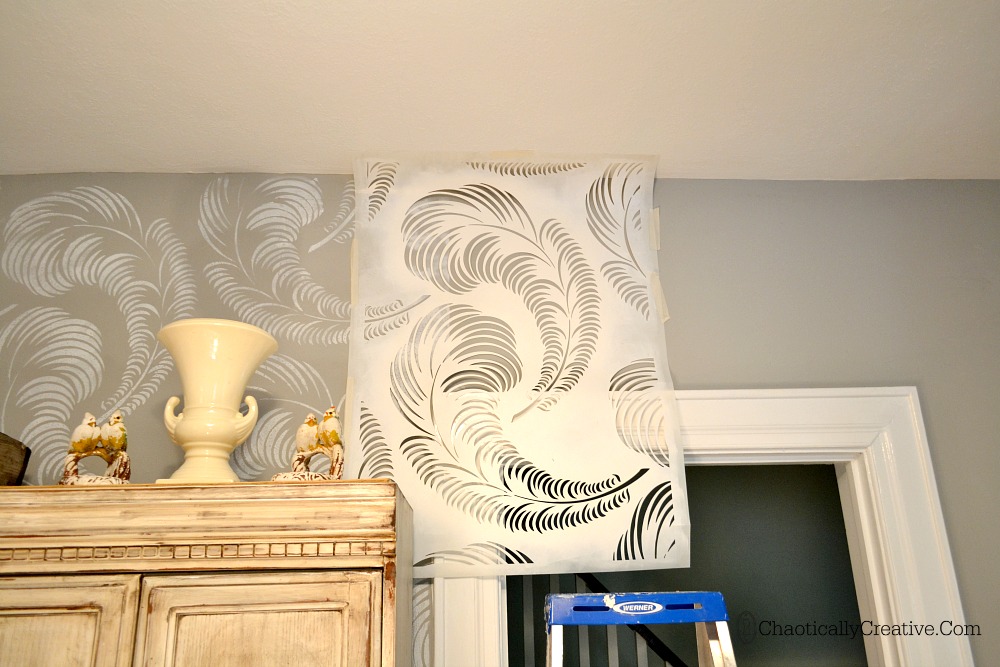
Royal Ceiling Paint in White. The ceiling in this office took a lot out of me. Sign in remembrance. I actually started out thinking about stenciling the ceiling. I am soooo glad that I did not do that because, I had a really hard time getting my Feather Stencil to adhere to the ceiling when I was working on the top of the wall. That would have been a nightmare! Anyway, after the ceiling was repaired, I Kilzed the ceiling really really good and painted it bright white which really popped against the gray.
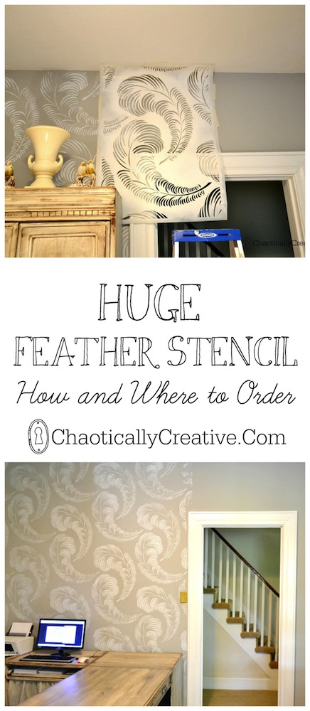
Feather Stencil from The Stencil Library using Folk Art Titanium White (see below for more details). I knew this was going to be hard and time consuming and I wasn’t about to do this with just an ordinary stencil. I wanted something BIG, different and dramatic. I knew that the pattern had to be somewhat forgiving as I am not perfect and neither are my walls. I also wanted it to have movement and not a geometric design. I searched high and low and pinning in between.
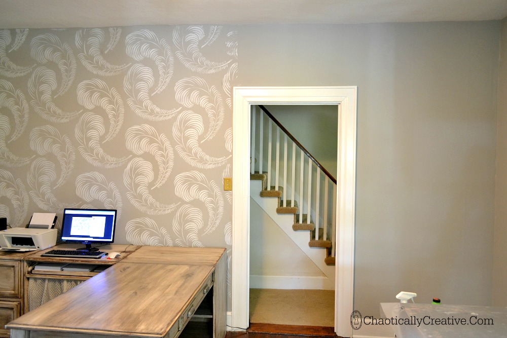
Side by side comparison of the difference the stencil makes. While the color of the walls alone is a vast improvement, the stencil really brightens it up.
(pay no attention to the ugly carpeted stairs in the background. They are on THE list.)
I will be doing an entire post on the stenciling process, but just in case you want to order this awesome stencil immediately, here are some details.
This is the large stencil. Dimensions are 21.6 X 32.9. This is cut on a 10 mil film. You will need to contact them before ordering to request the thicker cut. If you have a lot of doors, corners and windows, I would recommend ordering two. One in the thicker material for the walls and one in the thinner material for the tight spots. The thinner material is more flexible but not quite as durable. Rachel offers excellent customer service and she is a professional stencileer. She assisted me with this project and I highly recommend The Stencil Library.
Stay tuned for my stenciling adventures (if I ever get finished) and more tips on how to stencil an entire room!
Stay tuned for some office makeover adventures and tips!
Love the feathers!!!! May need to borrow this idea 🙂
Thanks! Yes, we would love to see what you do with it!
Love the walls! Beautiful color combo for the wall and stencil. Pinning it for later!
So glad you liked it Angie! Thanks for stopping by!
Absolutely gorgeous! These are just my style and colors! Thank you so much for the inspiration.
Thanks so much Vickie. Glad you stopped by!
Let me say I HATE wallpaper — I’m probably being booed somewhere but I’ve spent too many hours trying to remove the darn stuff. I do love the feather print — the perfect solution for those who want some eye appeal without making it permanent. I also how it is a soft appeal rather than in your face!! Great job!
I love the look of some wallpaper but I agree taking it down is a pain that’s why stenciling seems to be the best solution. If only it was easier to do.
VERY pretty. Though I just got a beautiful chair for my bedroom, a stencil might jazz up the plain walls a bit. Thanks for sharing.
I love the progress pics and description. I especially like the ‘half and half wall’ photo and am looking forward to seeing the finished room. I know that the stencil work was not all plain sailing but I think your patience was well rewarded. This looks really wonderful!
Thanks Helen!
Wow, looks like a lot of work! It paid off though and looks great! I would have never thought of a stencil to brighten up a room!
Yes! It really brought the room to life! Thanks for stopping by!